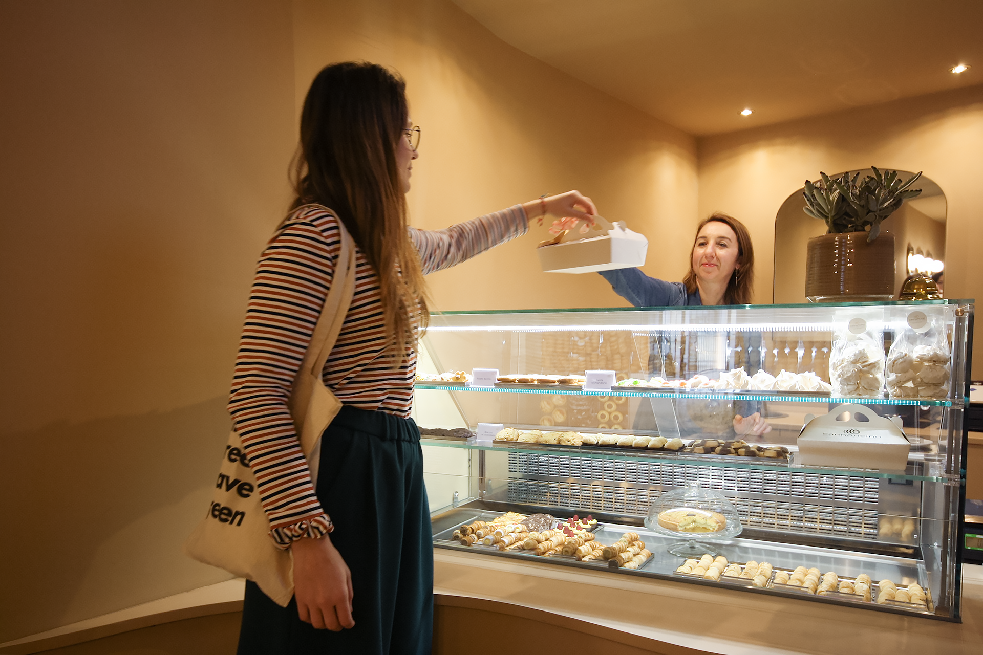
When it comes to branding, the clear and precise requests of the client cannot be ignored. Searching for the name, creation of the logo, choice of location, renovation and interior design project, so on Vanda Studio has created this "Total Concept" for a young pastry chef with a big dream, to prepare and sell cannoncini, a typical Italian pastry that collects a soft cream inside its crumbly dough.
“Imagine entering a freshly baked crunchy cannoncino, hear the noises muffled by the softness of the custard, immerse yourself in the curves of sweetness, smell the scent of butter and icing sugar”
vanda
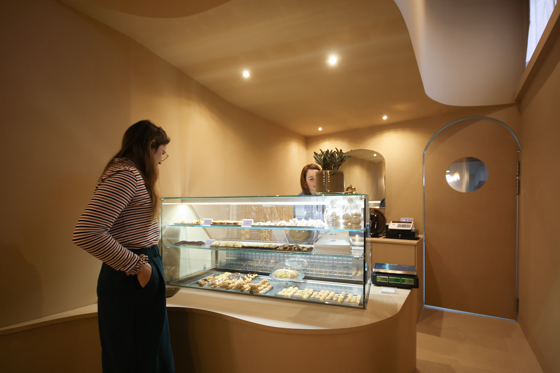
Once the location was found, the most interesting work was to convey the brand through the name and the peculiarity of the product through the location. For those unfamiliar with it, the cannoncino has an external spiral-like rind, which in itself can be considered a food-architecture: its shape in fact ensures that the pasta is "structurally" resistant, ensuring the use of less dough. and allowing it to be filled with cream which in itself has a specific weight higher than that of the pasta itself. This is why its so peculiar shape was used to be able to draw both the name "Cannoncino" and the logo of the Brand, a stylization of the shape of the cannon.
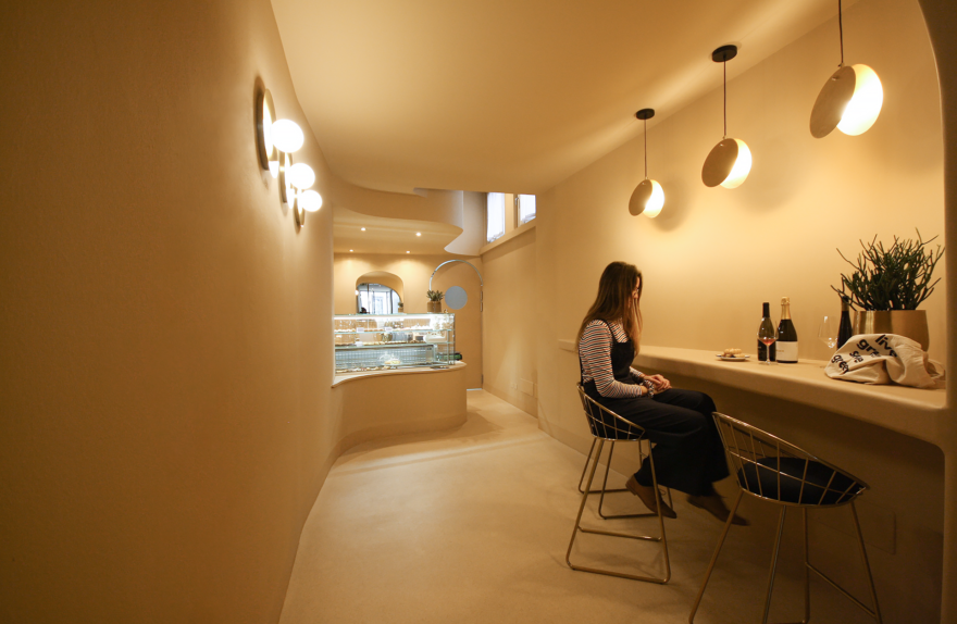
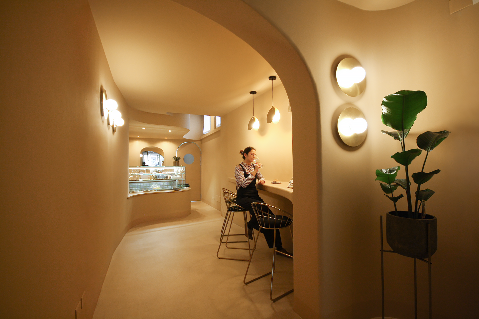
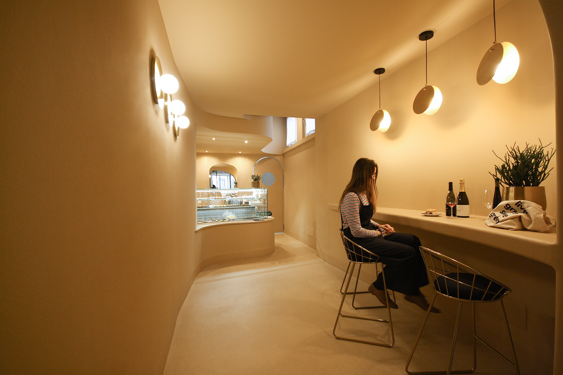
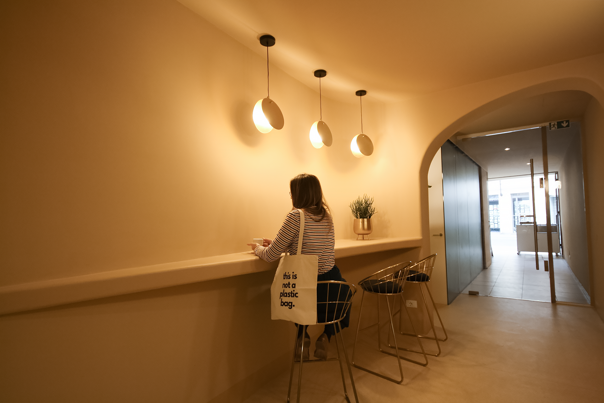
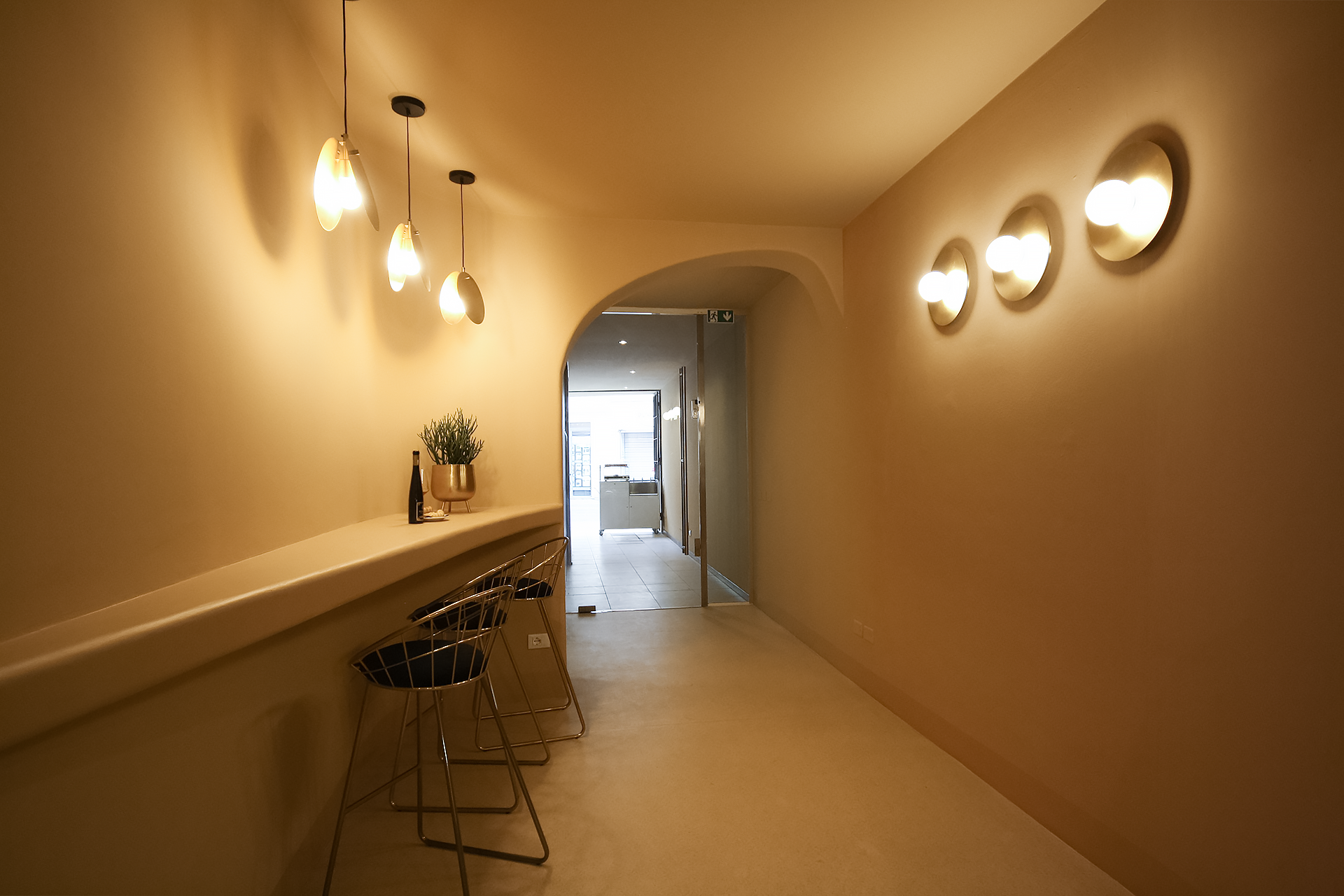
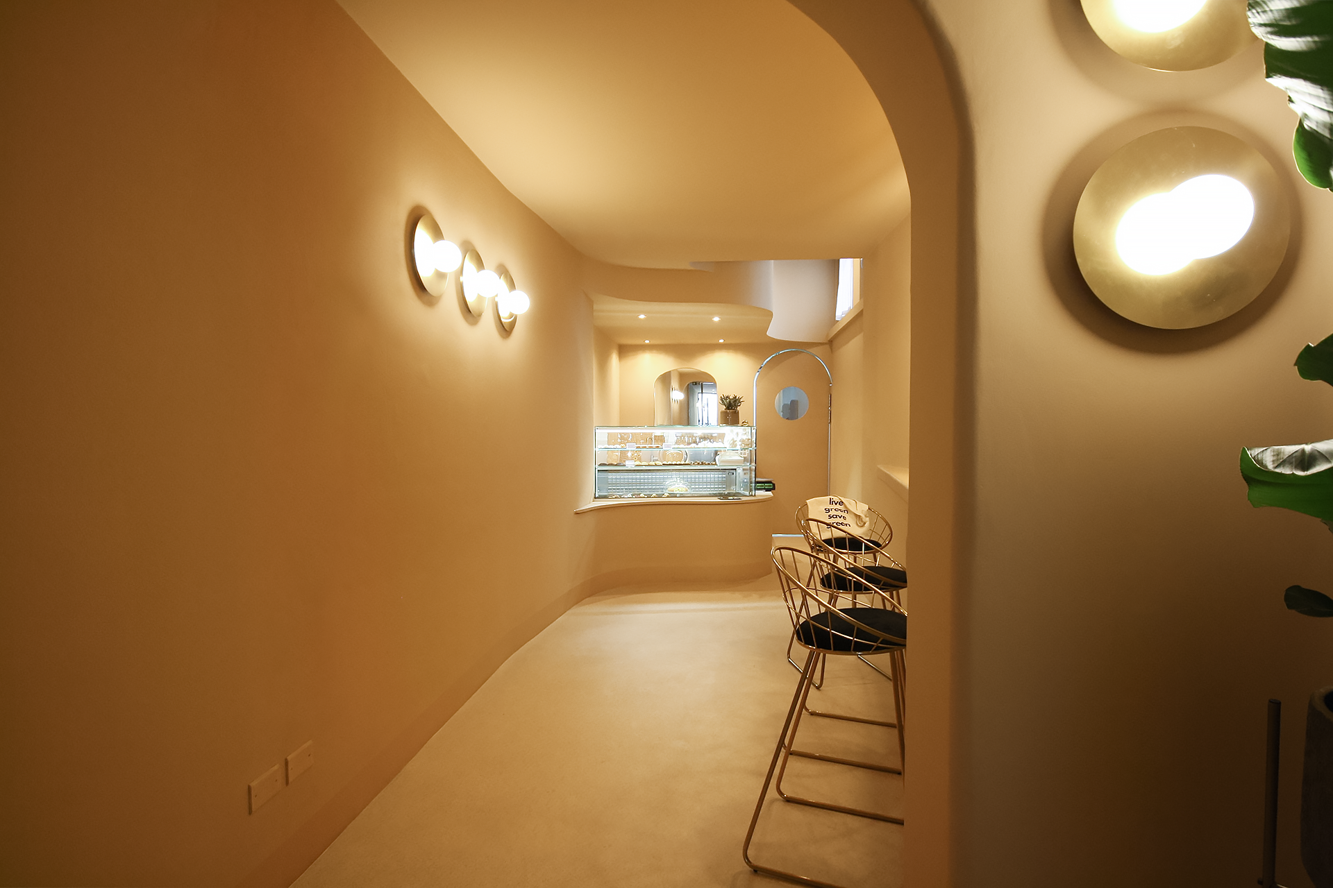
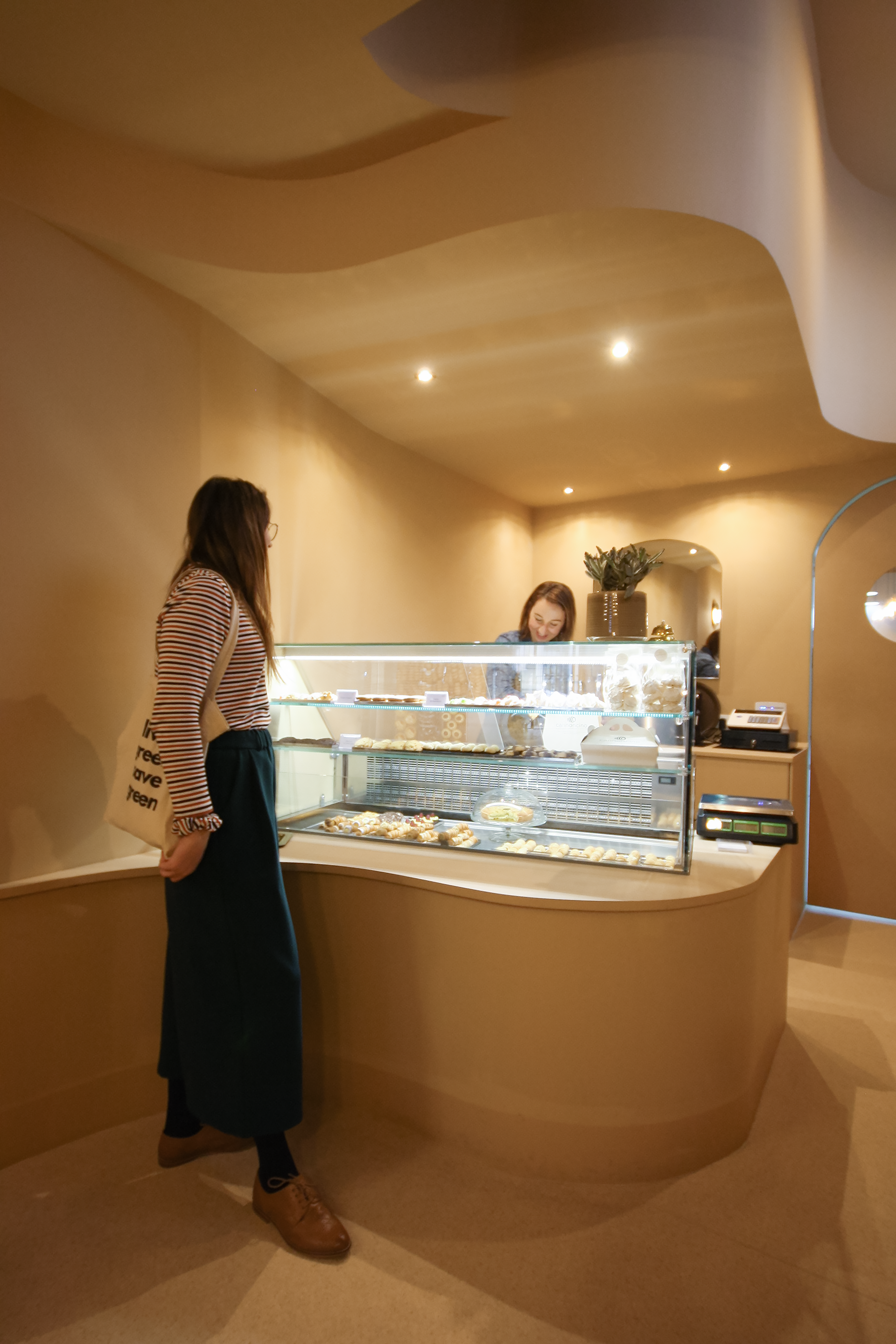
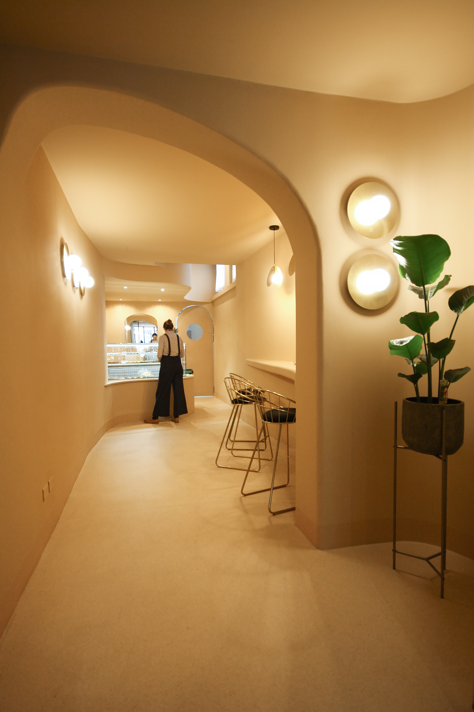
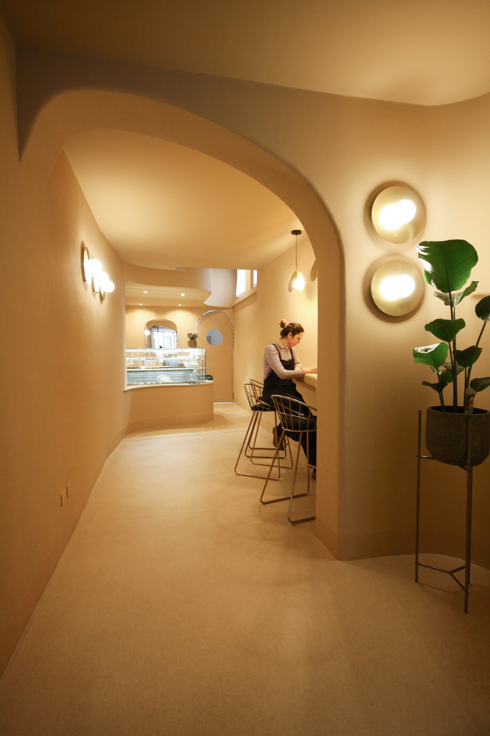
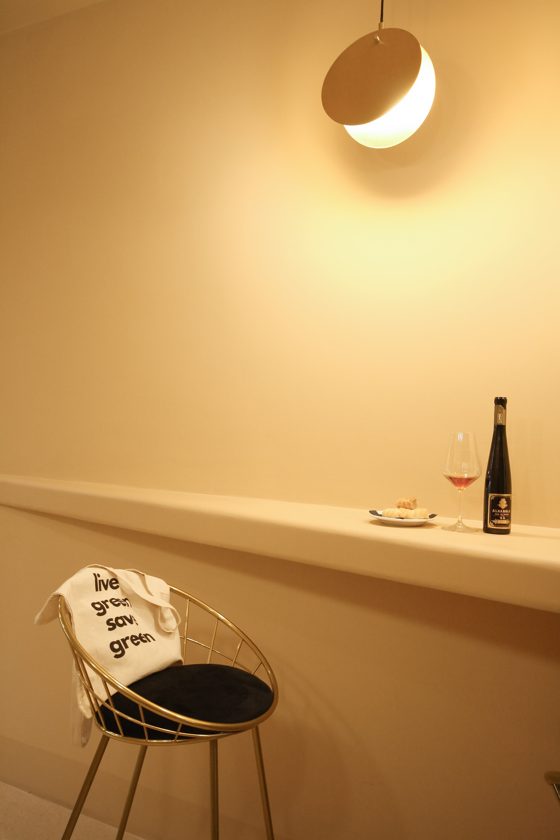
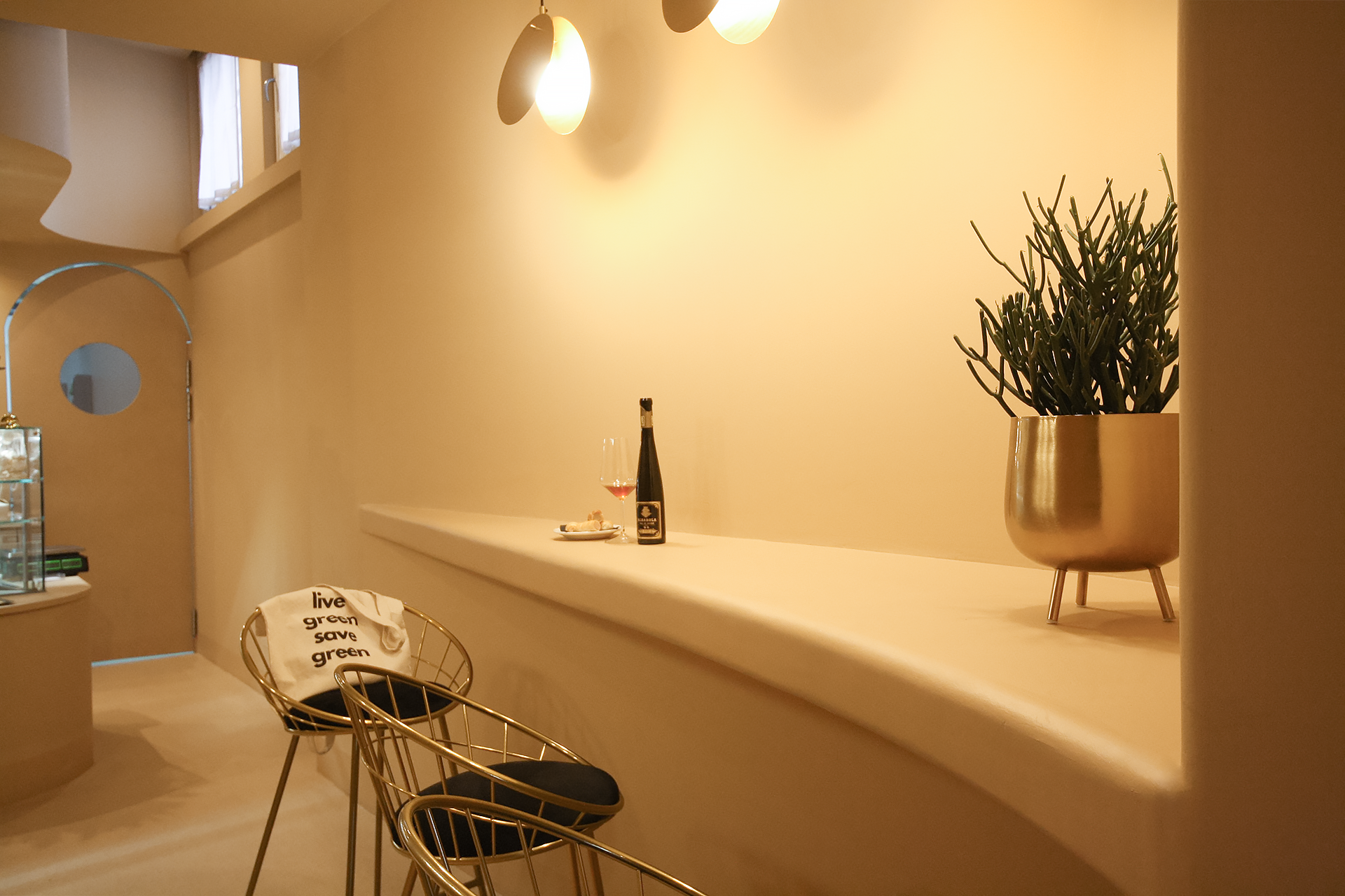
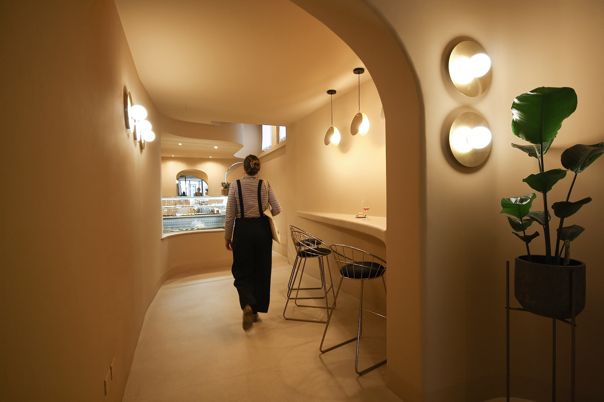
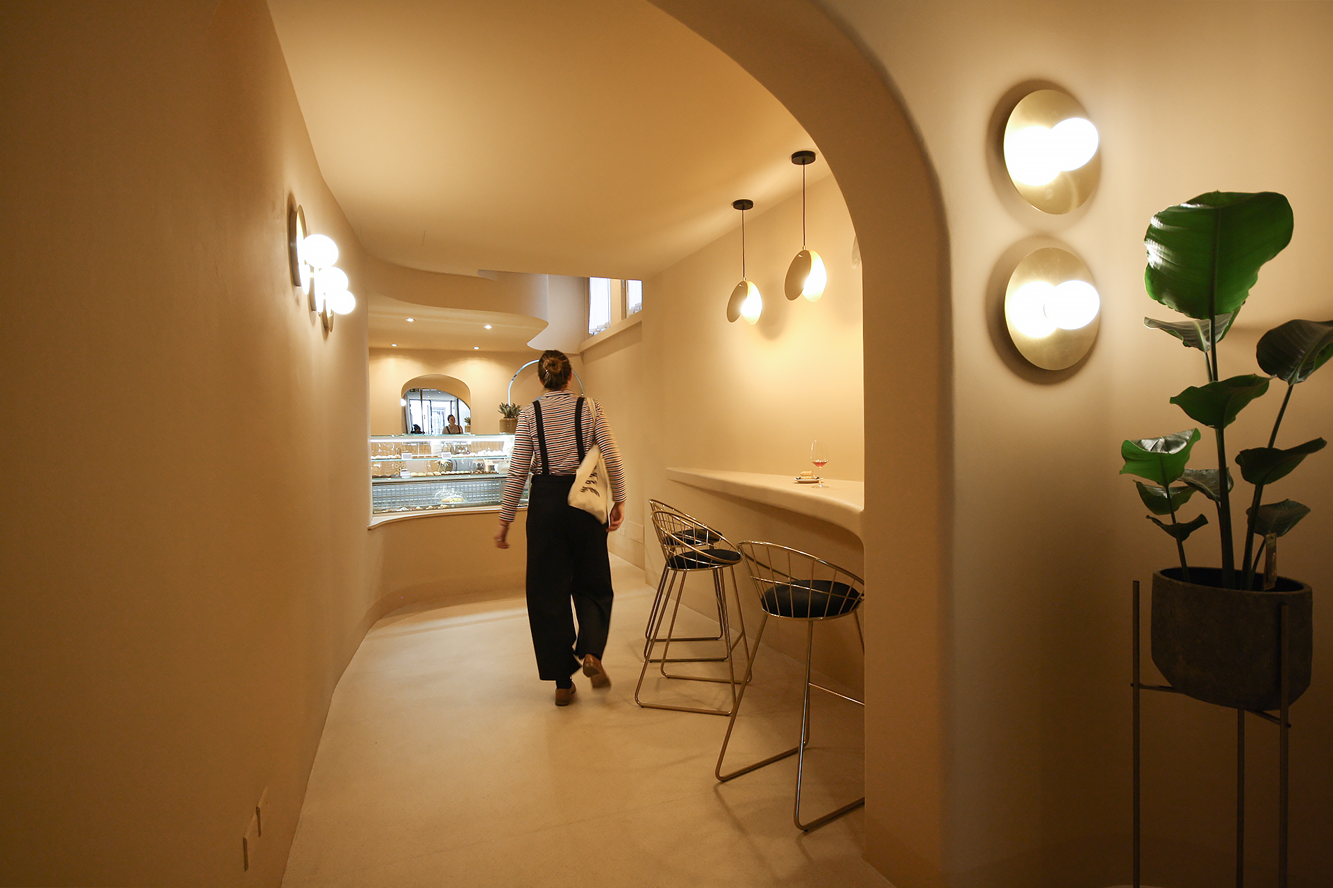
From that point on, defining the connotation of the place as an expression of the brand has become of fundamental importance. The Studio, inspired by the organic architecture of the Goetheanum in Dornach by Rudolf Steiner, wanted to introduce the sinuous and soft shapes, almost eliminating every corner and replacing it with curved shapes. The feeling is to enter a muffled place, which wants to leave out the noises and stress of the world to be able to enjoy a "sweet" rest. In addition to organic shapes, the space gives a feeling of welcome thanks also to the use of a single color that is distributed on all surfaces, creating plays of shadows and chiaroscuro: the color chosen is beige or also called "custard" color. , that of the cannon.
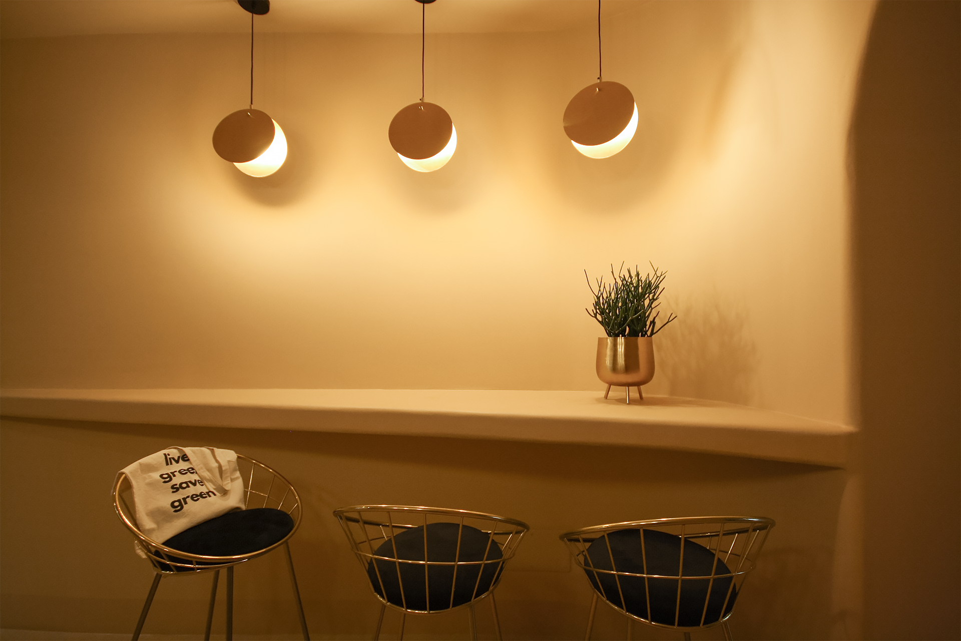
To emphasize this play of soft lines and asymmetrical curves is added the play of luminous suspensions in brass with a circular shape whose light is diffused indirectly and never clearly. The choice of furnishings reflects the same style also in the choice of materials, metallic and bronzed, never in contrast but which instead blend with the background and reflect it, giving it points of light.
project info
Project name: Cannoncino (@pasticceriacannoncino)
Architecture Office: vanda
Location: Corso Vittorio Emanuele II, 182, Piacenza (Italy)
Year of conclusion: 2021
Architectural photographer: Valentina Elmiger
Furnishings:
Bar Stools: Homecom
Mirror: Westwingnow
Lighting: Mazzolaluce, Amlux, Kavehome, Westiwingnow