Red is a color with multiple meanings, it is the color of indispensable elements for life such as blood, heart, and muscles. How to use it in your interior design?
Red is the color of aggression and danger, but also of passion and self-confidence. Indispensable for heating environments, especially on gray winter days.
It has been scientifically proven that those who are in an environment surrounded by red painted walls undergo an acceleration of vital functions: increase in heart rate, acceleration of respiratory rate, increase in blood pressure.
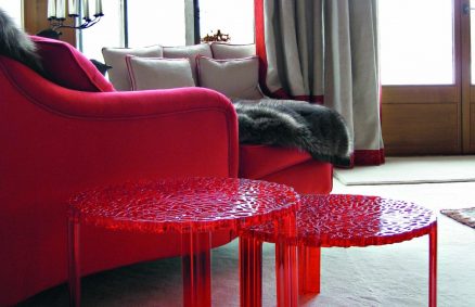
In Living
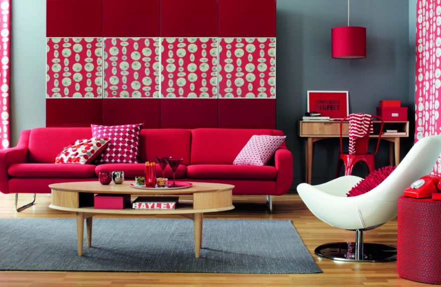
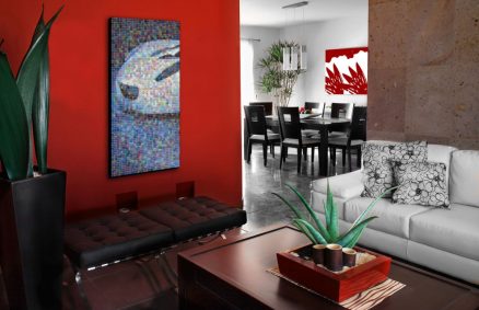
Red helps fight passive energies, so it infuses extraordinary psychic and motor strength. Those who prefer this color have a strong personality, this can also be reflected in the furniture, however it is generally a color not recommended for a monochromatic interior design. It is preferable to use red only in certain parts of the house such as a wall, or to insert elements such as a pouf a armchair a carpet of cushions a sofa. It is a color that easily brings excellent results in neutral-colored environments, where we can use it to give color accents. For example, a small red detail is enough to light up a room where gray tones dominate, or in an interior design based on the alternation of black and white.
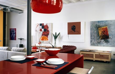
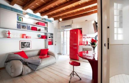
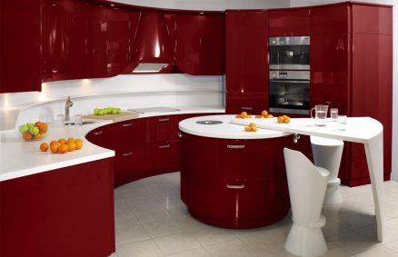
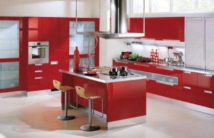
In the Kitchen
Red has the power to stimulate the appetite, so the kitchen and dining area are ideal areas to use this color. We can use it to paint one or more walls, or for furniture or appliances such as for example the refrigerator.
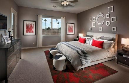
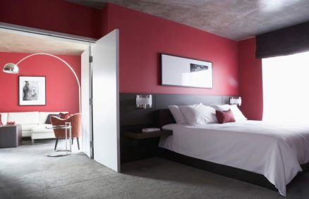
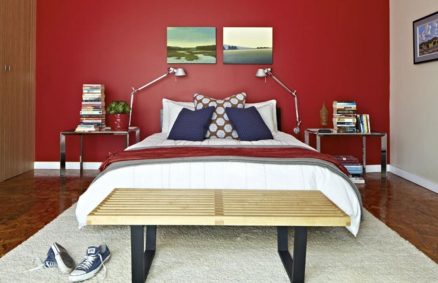
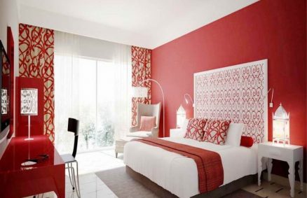
In the bedroom
Precisely because of its characteristics of vitality and accelerator of vital functions, red is more suitable in the living area.It is the color of love and passion, but it does not promote rest, so it is better to avoid it in the bedrooms. bed and relaxation areas especially for painting the walls, but here too we can use it for furnishings and accessories as a bedside table, Cushions, glass vases, lamps.
Wanting to stay in the field of red to paint the walls of bedrooms or relaxation areas, we can use lighter shades such as pink or peach, also suitable for bedrooms, especially for girls.
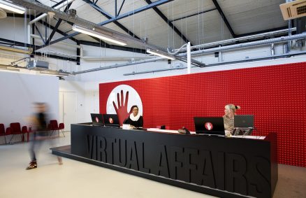
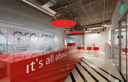
In office
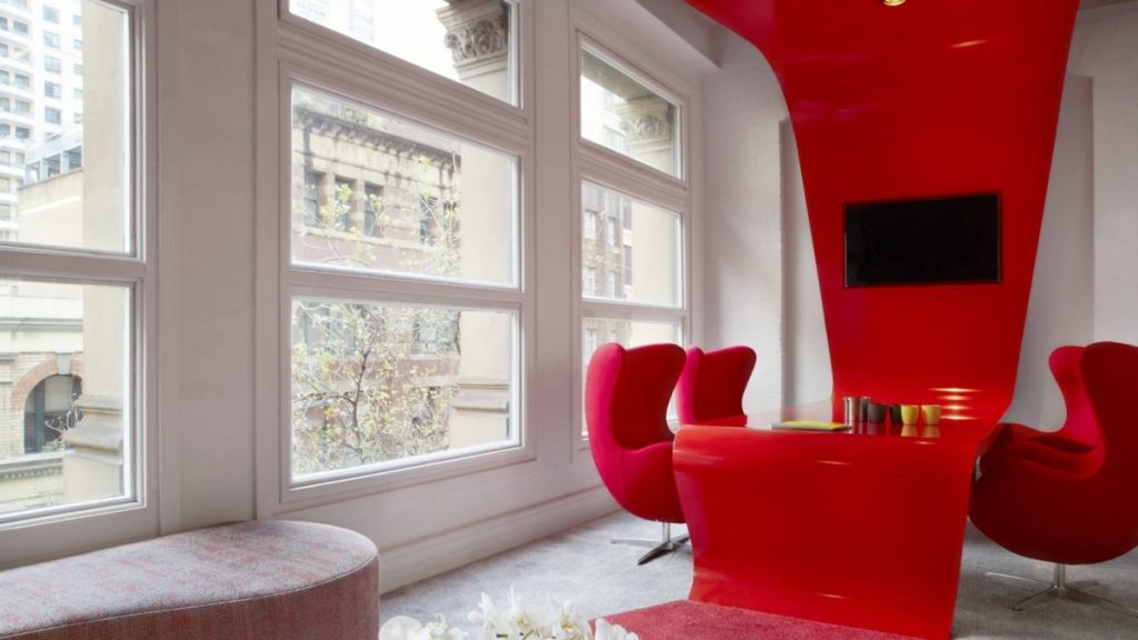
Red is an index of self-esteem so it can be used in offices, it is ideal for example in reception spaces, where it is important to communicate the character of the company, for example both on some walls and on the reception desk, or even here we can insert furniture like a sofa or seating. Another effect that can be interesting from the point of view of furnishing office spaces is that red stimulates creativity, so it is very suitable for creative spaces, especially in declinations that tend towards orange.
pairings
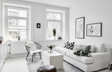
Matching red with other colors is not always easy, but there are some colors, especially neutrals with which you can create very interesting combinations, for example white softens its aggressiveness, while with black it gives life to environments with a dramatic and scenographic atmosphere. Other happy combinations can be with gray or brown to create warm and welcoming atmospheres.
summary sheet
FEATURES
- It is a warm and lively color.
- a strong personality index.
- It is the most powerful color, best to use it for more than over the walls accessories.
EFFECTS
- It increases blood pressure and breathing rate.
- It is capable of accelerating human metabolism.
- It stimulates the appetite.
- It stimulates creativity.
FEELING CAUSED
- Great color to use when we want to represent power.
- Bright red: feeling of great energy.
- Dark red: feeling of power and elegance.
RECOMMENDED
- Bedroom for passion, but only in some details because it does not favor rest.
- Kitchen or dining area.
- In environments exposed to the north, especially in winter.
- As accent color in environments with neutral dominant shades.
- In the creative or reception spaces of offices
NOT RECOMMENDED
- A red monochrome interior design.
- In the bedrooms because it is not conducive to rest.
MATCHING
White, black, gold, blue, green, purple.
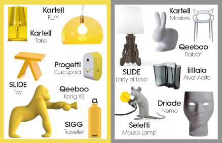
in the images that follow other examples of how to use red in furniture that can be useful for your home.
We recommend our selection of products that can help you give a color accent to your interior design.
-
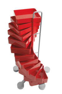
Mobile Drawer Spinny Red Design Studio Joe Colombo for B-LINE
€1.673,00 -
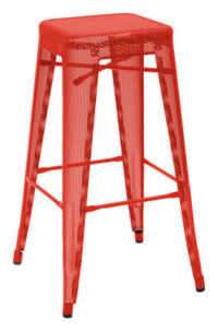
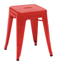
High stool H - H 75 cm Red design Chantal Andriot for Tolix
€285,00 -
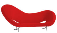
Victoria and Albert Sofa - Model 2 Red design Ron Arad for Moroso
€10.596,00 -
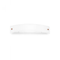
Mille L Wall Lamp 1x120W White | Nickel | Red design Centro Design LLG for Linea Light Group
€70,96 -
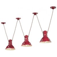
Industrial C1692 Red Suspension Lamp by Ferroluce
€514,35 -
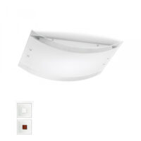
Mille LED Wall Lamp AP PL M White | Nickel | Red design Centro Design LLG for Linea Light Group
€196,90 -
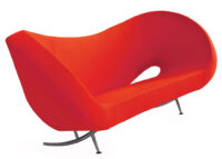
Victoria and Albert Sofa - Model 1 Red design Ron Arad for Moroso
€8.184,00 -
Low stool H - H 45 cm Red design Xavier Pauchard for Tolix
€165,00